There are lots of brilliant football kits floating around, from the timeless and barely changing England all white to West Germany’s 1990 simple stripe and classy single-color USSR and Netherlands kits from the 70s and 80s. But for every kit memorable in a good way, there is at least one you wish you could forget about completely. However, once you have seen some of these kits there is no forgetting them.

These are some Football Kit trends that we hope not to see again. Make sure that you order your Discount Football Kits from a reputable supplier such as www.kitking.co.uk to ensure your team doesn’t end up on the worst dressed list.
Terrible 1970s Wallpaper
As recently as the 1990s, wallpaper patterns that, luckily, went out of fashion decades before were being revived for top-flight football team kits. Thankfully this is not a trend that has returned. Australia’s 1990 kit is a great example of one that we hope will never see again, with an eye-watering impressionist pineapple pattern.
Scunthorpe’s 94/95 away kit is another example, featuring blue and yellow blotches on a red pinstripe, and invoking feelings of utter disgust in the viewer.
Lastly comes Norwich City’s 93/94 home kit, which strongly resembles a yellow and green version of a London Underground seat.
‘Natural’ Prints
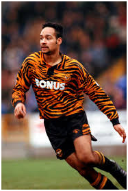
Referred to by one commentator as the ‘Hull City Disaster’ is Hull city’s 92/93 tiger stripe kit, which is the sort of thing you wouldn’t even see on a Geordie Shore repeat.
This doesn’t end with terrible animal prints or in the 90s, though. Spain’s Deportivo Palencia went with an incredibly creepy flayed muscle kit starting in 2016, which may not be the ugliest kit on this list, but it is just strangely anatomically correct.
Along similar lines but a bit more stylized, we have Italy’s Reggina, which has been using male torso kits since at least 2012. A few years back, they may have resembled a cheap novelty shirt, but they have progressed to something much more stylized but still strangely anatomical.
Eye-Watering Test Patterns
Lastly, we’ll come to those kits that evoke feelings of television not quite getting a signal, with static and flickering images. No kit quite embodies that aesthetic like Norway’s 1996 away kit, complete with 1980s-era text effects and actual static.
Eastern Europe’s fashion sense might have been impaired slightly by communism, but that can’t excuse Estonia’s 1996 kit, which had not one but two horrible clashing patterns.